Can Your Code Detect Colors in Images? Isolating Features with a Mask (Part 1)
Introduction
Ever wondered how software can 'see' and interpret specific lines or shapes in an image? In this series, we'll dive into the basics of image processing with Python and OpenCV, focusing on how to detect features based on their color. We'll start with a common and fundamental technique: creating a color mask.
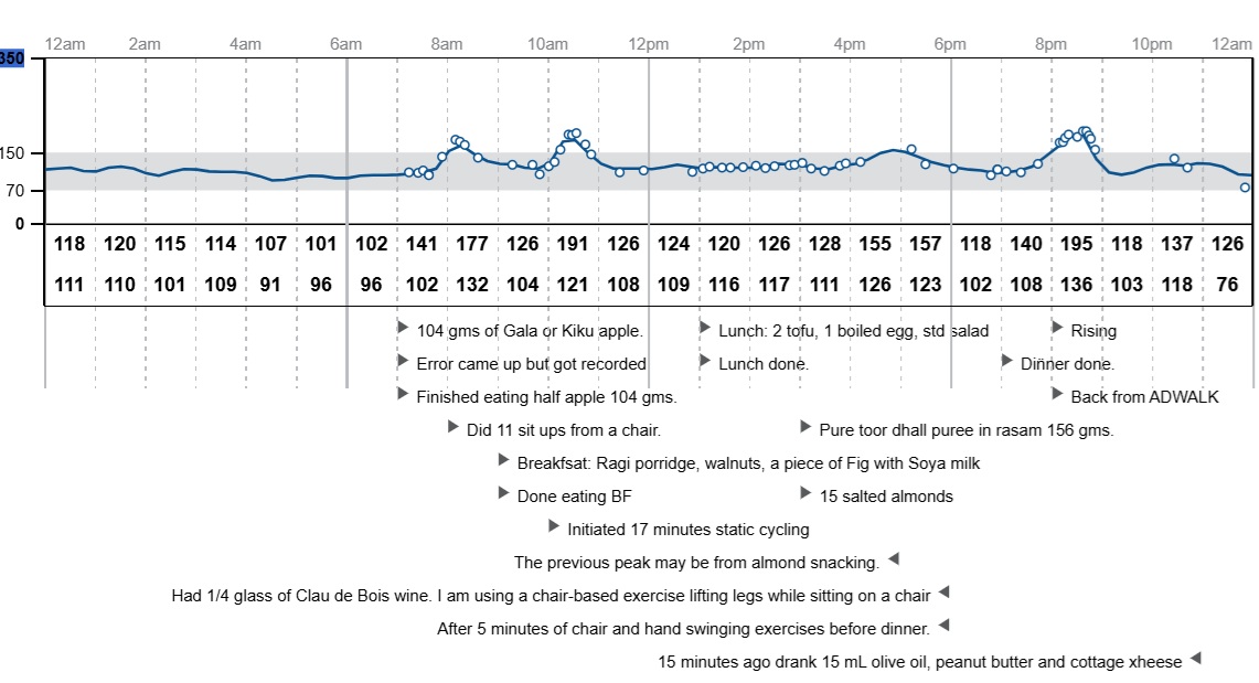
We'll use a real-world example: extracting the glucose curve from a FreeStyle Continuous Glucose Monitor (CGM) sensor graph. This program (MaskImage.py) will show you how to detect a specific blue-colored feature in an image.
Here's the kind of graph we're working with:

Here is an image stripped of text, which we will use in our code example:

(Note: In an earlier post, we covered extracting text from sensor reports. You can find that tutorial [link to earlier post here].)
The Core Idea: Isolating Colors
When an image processing program "looks" at an image, it sees a grid of pixels, each with a numerical color value. To find a specific object or line, one powerful method is to isolate all pixels that fall within a certain color range. This is where a "mask" comes in.
Understanding Color Spaces: Why HSV?
First, we load our image. Notice we convert it from BGR (Blue, Green, Red – the default way OpenCV reads colors) to HSV (Hue, Saturation, Value). Why HSV? It's super useful for color detection because it separates the actual color (Hue) from how vibrant (Saturation) or bright/dark (Value) it is. This makes our color detection more reliable, even if the lighting in your image isn't perfect.
For our blue glucose curve, we define a range of HSV values that represent "blue."
Creating the Color Mask
The magic happens with cv2.inRange(). This function scans every pixel in our HSV image. If a pixel's color falls within our defined blue range, it turns that pixel white (255) in a new, binary image called the mask. Otherwise, it turns the pixel black (0). Think of the mask as a filter: it isolates only the blue parts of our graph, making them stand out against a black background.
Let's See the Code: MaskImage.py (Part 1)
import cv2  # OpenCV library for image processing
import numpy as np  # NumPy for numerical operations, especially with arrays
import matplotlib.pyplot as plt  # Matplotlib for displaying images and plots

# 1. Load the image and convert its color space
# Make sure "LibreViewOneDayGraph.jpg" is in the same directory as your Python script.
img = cv2.imread("LibreViewOneDayGraph.jpg")
img_hsv = cv2.cvtColor(img, cv2.COLOR_BGR2HSV)

# 2. Define the color range for our blue glucose curve
# [Hue, Saturation, Value] - These values define the specific range for "blue".
lower_blue = np.array([100, 50, 50])
upper_blue = np.array([140, 255, 255])

# 3. Create the 'mask' - our color filter!
# This function identifies all pixels within the specified blue HSV range.
mask = cv2.inRange(img_hsv, lower_blue, upper_blue)

# --- Visualize the Mask ---
# We'll display the original image and the generated mask side-by-side.
plt.figure(figsize=(12, 6)) # Adjust figure size for better viewing

plt.subplot(1, 2, 1) # This sets up a plot grid: 1 row, 2 columns, first plot
plt.imshow(cv2.cvtColor(img, cv2.COLOR_BGR2RGB)) # Convert back to RGB for Matplotlib display
plt.title("Original Image")
plt.axis("off") # Hide axes for cleaner image presentation

plt.subplot(1, 2, 2) # Second plot in our grid
plt.imshow(mask, cmap='gray') # Display the 'mask' in grayscale (black and white)
plt.title("Generated Mask (Blue Trace Highlighted)")
plt.axis("off") # Hide axes

plt.show() # Show both plots
Key Code Lines Explained
Let's break down the most important parts of the code:
import cv2,import numpy as np,import matplotlib.pyplot as plt: These lines bring in the necessary libraries.cv2(OpenCV) is for image processing,numpyfor handling numerical arrays (images are treated as arrays of pixels), andmatplotlib.pyplotfor displaying images.img = cv2.imread("LibreViewOneDayGraph.jpg"): This line reads your image file from the specified path. Make sure the image file is in the same directory as your Python script, or provide the full path to the image.img_hsv = cv2.cvtColor(img, cv2.COLOR_BGR2HSV): This is crucial. It converts your image's color representation from BGR (Blue-Green-Red, which is how OpenCV loads images by default) to HSV (Hue-Saturation-Value). HSV makes it much easier to isolate colors based on their "true" shade, rather than a mix of red, green, and blue components.lower_blue = np.array([100, 50, 50])andupper_blue = np.array([140, 255, 255]): These NumPy arrays define the range of HSV values that we consider "blue."The first number (0-179) is Hue, representing the actual color (e.g., 0 is red, 60 is yellow, 120 is blue).
The second number (0-255) is Saturation, representing the intensity or "purity" of the color (0 is gray, 255 is vibrant).
The third number (0-255) is Value, representing the brightness (0 is black, 255 is bright). We've set a range that should capture most shades of blue without picking up other colors.
mask = cv2.inRange(img_hsv, lower_blue, upper_blue): This is the core filtering step. It takes your HSV image and applies the defined color range. Any pixel whose HSV value falls withinlower_blueandupper_bluewill be set to white (255) in themaskimage, and all other pixels will be set to black (0).plt.imshow(cv2.cvtColor(img, cv2.COLOR_BGR2RGB))andplt.imshow(mask, cmap='gray'): These lines use Matplotlib to display the images.For the original image, we convert it back to RGB (
cv2.COLOR_BGR2RGB) because Matplotlib expects images in RGB format, unlike OpenCV's BGR.For the
mask, we tell Matplotlib to display it as a grayscale image (cmap='gray') since it's a binary (black and white) image.
What Just Happened?
The images created by the subplots are shown here:

In the left subplot, you saw the original glucose graph. On the right, you saw the mask image. Notice how the mask is mostly black, but the blue glucose curve from the original image now appears as a distinct white curve. This mask is a powerful tool because it allows us to easily focus on and extract the specific feature we're interested in, ignoring all the surrounding details like grid lines or text.
Next Steps & Beyond Color Detection
We've now successfully isolated our target feature using its color! In the next part of this series, we'll explore how to take this mask and actually extract the precise pixel coordinates of the curve. In the next part, we'll walk along the x-axis and pick up y-intersections, creating (X,Y) coordinate pairs that can then be saved to a CSV file for further analysis.
While this method works great for distinct colors like blue, detecting features that are black, white, or various shades of gray often requires different techniques (like grayscale thresholding or edge detection). We'll briefly touch upon these advanced concepts in future discussions, but for now, you've mastered the art of color-based masking!
Getting Started:
If you need a refresher on how to import and set up Python libraries, please refer to our earlier tutorials on this blog.
